Details
-
Improvement
-
Status: Reopened
-
 Normal
-
Resolution: Unresolved
-
None
-
None
-
None
Description
There are a few design and structural problems with the current implementation of the menu link picker; some changes need made.
Acceptance Criteria
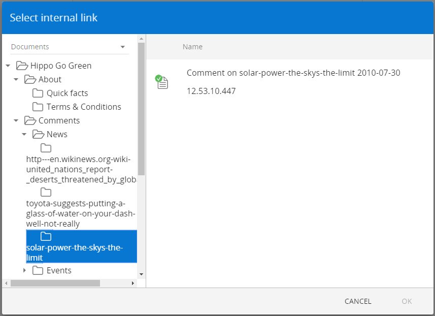
1. Please see documents_in_left.png. In some cases, when within the 'Documents' dropdown, document names are displayed; only folders and folder names should be displayed. Documents should only appear in the right-hand panel and should not be represented in the left-hand panel. Documents selection only.
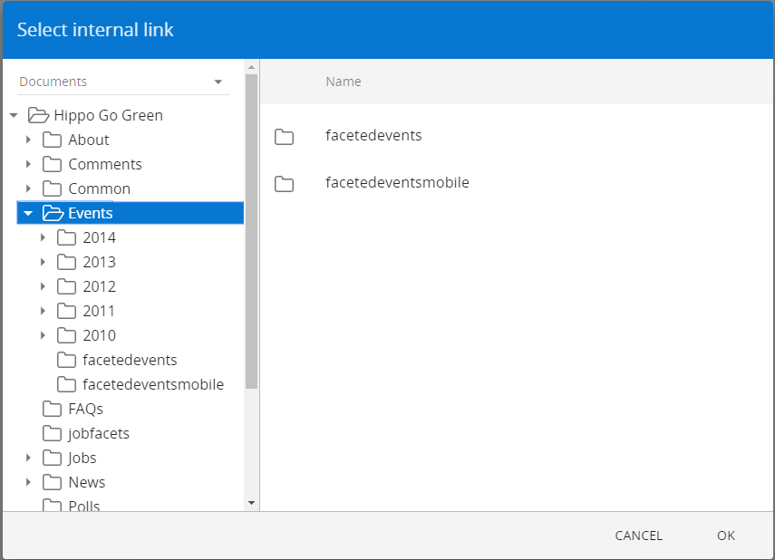
2. Please see folders_not_shown.png. In some cases not all folders shown on the left are shown on the right. In the attached image 7 subfolders (one level down) are displayed on the left, but only 2 of them are displayed on the right. Documents selection only.
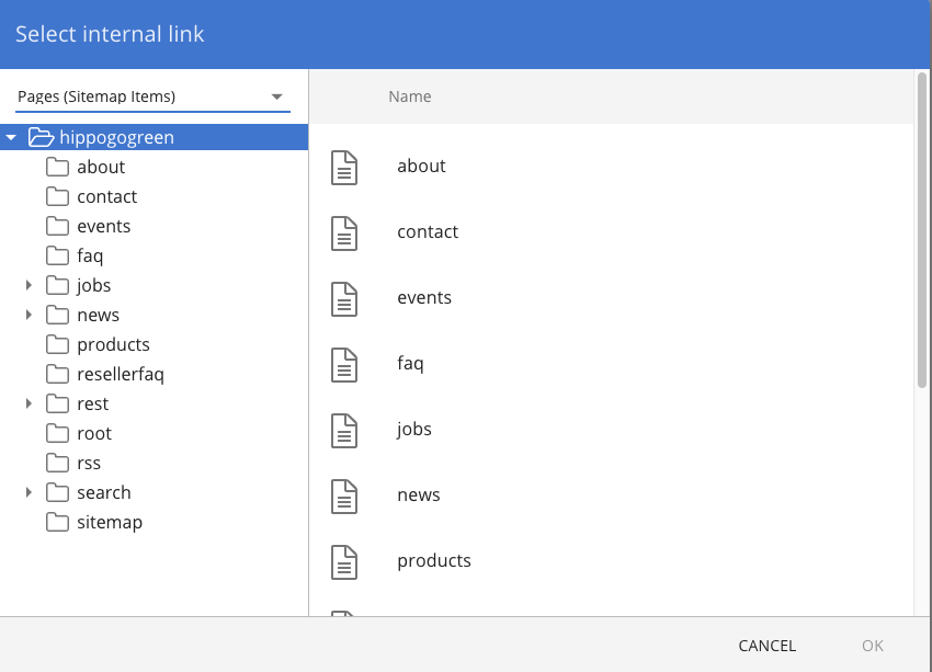
3. Please see sitemap_items.png. The left-hand panel should contain channels only; each one should be represented by a channel icon. If a user clicks on one of the channel icons the right-hand panel updates and shows all pages within that channel- like in the current sitemap- see sitemap listing.png. Pages selection only.
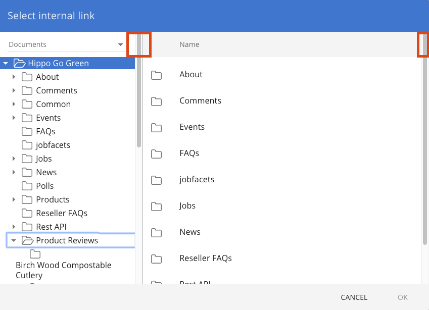
4. Please see focus_rectangle.png.
- When an item is selected in the left-hand panel (for documents or sitemap items) no blue outline should be displayed; this needs removed from the current implementation.
- The focus rectangle is only displayed when the user uses the keyboard to move focus to another folder in the tree structure (the selection doesn't change)
- The focus rectangle should be an actual rectangle
5. When a user hovers over an item in the left-hand panel a hover-effect is shown on the item- please speak with Carolien re. what this should look like. Documents and pages.
6. If a user clicks on a folder (documents only) in the left-hand panel which is expandable the folder expands on a single-click (and is in a select-state). At the moment users need to click on the expand arrow specifically to expand the folder.
7. If a user clicks on a folder (documents only) in the right-hand panel which is expandable the folder expands on a single-click and the other folders, and documents, contained within it are displayed in the right-hand panel.
8. Please see overlapping_scroll.png. For both documents and pages the scroll bar starts in the wrong place on both the left and right panel; it should start at the top of the listing and not at the top of the panel.
9. Keyboard controls should be so that the user can use the tab-key to navigate from control to control and arrow-keys to navigate within the control. So if the tree has focus, clicking an arrow would move the focus up or down in the tree, clicking tab would move the focus to the next control (the file list)
10. Padding in the drop-down (choice between Pages and Documents) should be such that the complete g (in pages) is visible; it is clipped now.
11. More in linked issue.