Details
-
Bug
-
Status: Open
-
 Normal
-
Resolution: Unresolved
-
None
-
None
-
None
-
2
Description
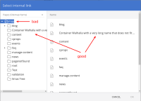
See the screenshot for the effect: when selecting a document or page for a menu item the internal link this picker can be used. If a name of an item on the left is long it is placed under the folder icon. This is weird: at first glance there seems to be an item without name.
The name should be placed next to the icon, however long it is. It may wrap or clip, but either is better than this.
When clipping: should the column be resizable to reveal longer names if necessary? Or shown as tooltip so you can see it there?
Attachments
Issue Links
- relates to
-
CMS-10989 Improve menu link picker- design and structure
-

- Reopened
-

