Details
-
Bug
-
Status: Closed
-
 Normal
-
Resolution: Duplicate
-
content-blocks-2.0.1, content-blocks-2.1.0
-
None
-
None
Description
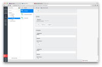
Content blocks has a feature to show the names of the blocks. This is turned off by default and can only be enabled through the console, as described here [1]. When this is turned on (which is very helpful, I think - we should consider turning it on by default), the name of the content block doesn't align nicely with the content of the content block, such as the caption of the first field of a compound, or UI text displayed for that type of content block. I'm attaching a screenshot showing mis-alignment between "Resource" and "Select a file to upload", or between "compound" and "String".
[1] http://www.onehippo.org/library/concepts/plugins/content-blocks/configuration.html
Attachments
Issue Links
- is duplicated by
-
HIPPLUG-1293 Content blocks: improve styling of block title
-

- Closed
-
