Details
-
Bug
-
Status: Open
-
 Normal
-
Resolution: Unresolved
-
13.1.0
-
None
-
None
-
None
Description
First, we should fix the blurry icons (CMS and ChannelManager) in Firefox (maybe Edge as well). This is only visible on regular low dpi screens, which is still the norm. I found a working solution here:
svg:not(:root) {
  overflow:hidden;
  transform: translate(0,0);
}
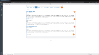
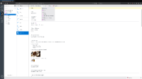
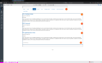
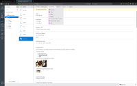
This fix moves the blurry icons a bit, which triggered me to do some visual diffing between chrome and firefox on low&high dpi screens.
The biggest difference I found in the CMS is that the line-height is not applied in the same manner between Chrome and Firefox.
Also, things like shadows (see the channel-manager empty container) and font colors are different.
For the login page, I've updated the normalize.css to the latest version, this might very well be the fix we are looking for with regards to the difference in line-height. This will require an update of the grunt build of the cms-api module (should be more/less the same as the cms-login module).
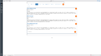
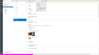
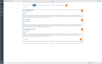
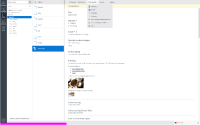
I've attached some visual diff screenshots as a reference.
Attachments
Issue Links
- relates to
-
CMS-8995 Many icons are blurry in Firefox and IE
-

- Closed
-


