Details
-
Bug
-
Status: Closed
-
 Normal
-
Resolution: Outdated
-
1.02.02
-
None
Description
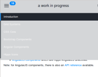
On small screen, the navigation menu is collapsed into a menu. The menu must be rendered the same as the navigation panel on wider screens but now has white text on a light gray background rendering it hard to read. The background of the menu should be the same as the widescreen-panel.
