Uploaded image for project: '[Read Only] - Hippo Theme'
  1. [Read Only] - Hippo Theme
  2. HIPPOTHEME-2

Layout improvement top notification element

    XMLWordPrintable

Details

    • Improvement
    • Status: Closed
    • Normal
    • Resolution: Fixed
    • 1.01.04
    • 1.01.05, 1.02.00
    • Sprint 89

    Description

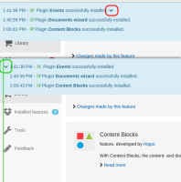
      The chevron which indicates that the notification bar can expand does not work very well on the right side. I would prefer to see it on the left side.

      Make sure to align it with the icons of the global navigation as you can see it in the attached image
      Attachments

        Activity

          People

            Unassigned Unassigned
            abensdorp Anton Bensdorp (Inactive)
            Votes:
            0 Vote for this issue
            Watchers:
            3 Start watching this issue

            Dates

              Created:
              Updated:
              Resolved: