Details
-
Improvement
-
Status: Closed
-
High
-
Resolution: Fixed
-
content-blocks-2.0.0
-
None
-
Tiger Sprint 114
Description
Incoming complaints from customers and developers:
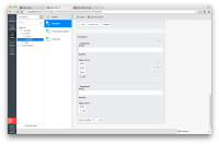
Content blocks look pretty bad, there is clear separation of added content blocks.
Basicly its missing the 'compound multiple' styling.
Also the 'add' button is missing the + icon. I've added screenshot1 and screenshot2.
We should pick this up as part of one of the Restyling PSPs.
Attachments
Issue Links
- is a part of
-
CMS-9536 Improve styling of content blocks
-
- Closed
-
- is forward ported by
-
HIPPLUG-1202 Forward Port: Improve styling of content blocks
-
- Closed
-
- testing discovered
-
HIPPLUG-1204 Undetached JcrItemModel log when validating an empty sub-field inside the content-block field
-

- Closed
-
