Uploaded image for project: '[Read Only] - Hippo Essentials'
  1. [Read Only] - Hippo Essentials
  2. ESSENTIALS-640

banner components do not neatly fit in their container

    XMLWordPrintable

Details

    • Bug
    • Status: Closed
    • Normal
    • Resolution: Fixed
    • CMS-10.0-alpha-1
    • 1.03.00, CMS-10.0-FCS
    • None
    • None

    Description

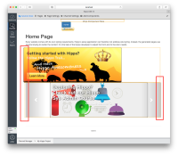
      After adding a banner to the container on the home page, it extends to the left of the container. After adding a carousel, it extends a bit to the right. I would expect them to be aligned on the left side.

      This is also visible on the live site.

      This happens in all browsers.

      Experienced this both with the freemarker and the jsp versions of the components.
      Attachments

        Activity

          People

            Unassigned Unassigned
            oscholten Oscar Scholten (Inactive)
            Votes:
            0 Vote for this issue
            Watchers:
            2 Start watching this issue

            Dates

              Created:
              Updated:
              Resolved: