Details
-
Improvement
-
Status: Closed
-
 Normal
-
Resolution: Fixed
-
None
-
None
-
None
-
Essentials trunk 1.01.04-SNAPSHOT
Chrome 35.0.1916.153 on Mac OSX
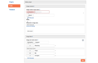
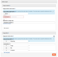
Description
The UI for the Gallery plugin is a garbled. UI elements are overlapping. Some elements are completely hidden/unreadable. Also as far as I can see what it should look like, I don't find it very intuitive. For example, image variants are always part of an image set, so why are these two elements completely separated in the UI? Also I can't see what variants an image set already has.

