Details
-
Bug
-
Status: Closed
-
Low
-
Resolution: Outdated
-
CMS-10.0-alpha-1
-
None
-
None
Description
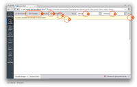
- Changes have been grouped in a dropdownmenu
The icon has been updatedalready done, seeCHANNELMGR-206
This icon has been updatedalready done, see BT-816- Between the gray and the yellow there is no border
- Between the yellow and the content area we use the standard stroke colour for notifications
- Edit alter ego should be positioned in the dropdown
- This dropdown should be styled in a similar matter as the dropdown in Content. Note, this dropdown has changed as well. See issue
CMS7-9011 - To save up space in the top bar I would like to move the edit alter ego link into the drop down menu next to the link to alter ego. This could be a link or a button. Whatever is easier.
- This dropdown should be styled in a similar matter as the dropdown in Content. Note, this dropdown has changed as well. See issue
- Notifications should stretch to the full with of the screen
