Details
-
Improvement
-
Status: Closed
-
 Normal
-
Resolution: Fixed
-
CMS-10.0-alpha-1
-
None
-
0.5
-
Tiger Sprint 116
Description
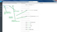
- The title is to long. "Hippo CMS 10.0.0 Enterprise Edition" would be fine
- This icon color should be blue
- I am not sure about the weight of the typography. I have the feeling we should use the same weight as used for request in (5)
- Admin should be bold in all cases
- All the text that is not a name like 'admin' or a document name like 'test' should be rendered as request in the top (5) Only the time stamp and items you cannot click on should be grayed out
The text "To the documents" must be updated to "To the content"


