Uploaded image for project: 'Hippo CMS'
  1. Hippo CMS
  2. CMS-8696

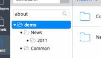
[browse-perspective] the selection highlight in the tree is too wide

    XMLWordPrintable

Details

    • Improvement
    • Status: Closed
    • Normal
    • Resolution: Duplicate
    • None
    • CMS-10.0-GA
    • None

    Description

      After implementing the new searchbox style it became clear that the selection widget of the tree is too wide.
      Attachments

        Activity

          People

            Unassigned Unassigned
            abogaart Arthur Bogaart
            Votes:
            0 Vote for this issue
            Watchers:
            2 Start watching this issue

            Dates

              Created:
              Updated:
              Resolved: