Details
-
Improvement
-
Status: Closed
-
 Normal
-
Resolution: Fixed
-
None
-
None
-
1
-
Quasar
-
Puma Sprint 257, Puma Sprint 258
Description
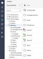
cdekort suggests in CMS-14317 to improve the styling of the icons for xpage folders and documents in the content perspective. See https://issues.onehippo.com/browse/CMS-14317?focusedCommentId=595396&page=com.atlassian.jira.plugin.system.issuetabpanels:comment-tabpanel#comment-595396.
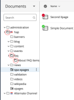
The starred folder icon in the tree seems smaller than the other folder icons. We want to change several icons to follow Material.
Icon assets link: https://drive.google.com/open?id=1yKXsbj0O67tHY6aZQuLCMTfo8VTXxKAD&authuser=nien-hua.gu%40bloomreach.com&usp=drive_fs
Invision design mockup: https://bloomreach.invisionapp.com/console/share/UP2BCG5S98/570090607
Acceptance criteria
Black in 60% (except status icons)
- 10px - to be switched
- Chevrons right
- Chevron down
- 16px - to be added / switched
- Folder opened
- Folder closed (small and large)
- X-page folder opened
- X-page folder closed (small and large)
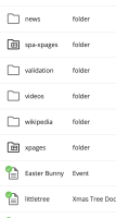
- 16px status - to be switched
- Status published
- Status modified
- Status offline
- 32px - to be switched
-
- Folder
- Page folder
- Doc
- Page
- Document type
- Compound fields
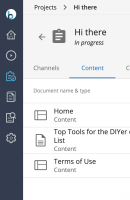
- 36px - to be switched in Project
- Page
- Doc

