Details
-
Improvement
-
Status: Open
-
 Normal
-
Resolution: Unresolved
-
None
-
None
-
None
Description
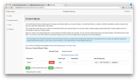
The Content Blocks Configuration UI contains a long text explaining what the plugin does (see screenshot).
In my experience large chunks of text in user interfaces are mostly ignored by users. So it takes up real estate while not being very effective or useful.
The actual UI itself (the form to add content blocks to doc types) is pretty intuitive IMO and works well.
I think a UI/interaction specialist should look into this, but IMHO the text should at least be shortened/minimized, possibly removed.
Note that the text also includes a message about the missing Beanwriter support for Content Blocks, so fixing that will already reduce the amount of text.
Attachments
Issue Links
- relates to
-
ESSENTIALS-517 Content Blocks Beanwriter support
-
- Closed
-
