Details
-
Improvement
-
Status: Open
-
 Normal
-
Resolution: Unresolved
-
None
-
None
-
None
Description
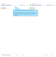
The top of the right side panel (for content and component editing) is a MdToolbar from the Angular material design. (https://material.angularjs.org/latest/demo/toolbar)
The bottom of the title and the icons are on the same line in the design. In our case we sometimes add a context above the title ("Component" or "Document"). This pushes the main title down, so the outlining is not so nice.
It is not clear yet how to fix this in a good, practical and easy way.
Also: in the header of the content editor there are now three icons, who have different spacing between them. Every icon is placed in a container of 40px width, but they do not have the same size, so they are not evenly spaced.
Attachments
Issue Links
- is a result of
-
CHANNELMGR-2165 Icons in the VE: remove click action
-

- Closed
-

