Details
-
Improvement
-
Status: Closed
-
Blocker
-
Resolution: Fixed
-
None
-
1
-
Quasar
-
Puma Sprint 259, Puma Sprint 260
Description
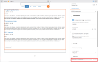
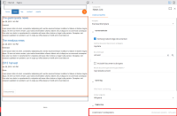
The component editor in the channel manager has buttons that don't fit (in Dutch) due to the length of the text. They aren't styled as buttons so it isn't even clear that they are buttons. When you give the editor more space the whole text can be seen but the leftmost button sticks to the left, while the rest of the buttons stick to the right. This looks strange and you would expect the spacing to be equal.
[Carolien] See required change in my comment below. (Styling of the buttons has already been changed as part of the 14.0 restyling effort.)

