Uploaded image for project: 'Hippo CMS'
  1. Hippo CMS
  2. CMS-12043

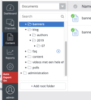
Move the dropdown arrow button in the folder tree of the content perspective a bit to the left so that (on a Mac) it won't be overlapped by the appearing scrollbar

    XMLWordPrintable

Details

    • Improvement
    • Status: Closed
    • Normal
    • Resolution: Fixed
    • None
    • 13.4.0
    • None
    • None
    • 0.5
    • Tiger
    • Tiger Sprint 212, Tiger Sprint 213, Tiger Sprint 214, Tiger Sprint 215

    Description

      Currently the spacing between the right side of the folder tree panel and the dropdown button is about 9px. The width of the scrollbar is about 16px.
      Increasing the spacing to 20px will prevent it from ever being overlapped by the scrollbar.

      (Note that in case of long folder names, the dropdown button is already rendered on top of the folder name, so its behaviour can remain unchanged.) 

      Attachments

        Activity

          People

            Unassigned Unassigned
            cdekort Carolien de Kort
            UX Issues UX Issues
            Votes:
            0 Vote for this issue
            Watchers:
            5 Start watching this issue

            Dates

              Created:
              Updated:
              Resolved: