Uploaded image for project: 'Hippo CMS'
  1. Hippo CMS
  2. CMS-10349

Group screens: no margin between fields and labels

    XMLWordPrintable

Details

    • Bug
    • Status: Closed
    • Normal
    • Resolution: Fixed
    • 4.0.1
    • 13.4.0
    • None
    • None

    Description

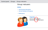
      CMS Admin panel, group screens: there are two fields Group name and Group description. The labels for these fields are immediately next to the fields themselves. Add a bit of padding or margin to make the distinction more clear. See screenshots.
      Seen in Firefox, Chrome and Safari.
      Attachments

        1. display group.png
          display group.png
          52 kB
        2. edit group.png
          edit group.png
          17 kB
        3. new group.png
          new group.png
          16 kB

        Activity

          People

            Unassigned Unassigned
            bleunis Bert Leunis (Inactive)
            Votes:
            0 Vote for this issue
            Watchers:
            4 Start watching this issue

            Dates

              Created:
              Updated:
              Resolved: