Details
-
Improvement
-
Status: Closed
-
 Normal
-
Resolution: Fixed
-
None
-
5
-
Tiger Sprint 193, Tiger Sprint 194
Description
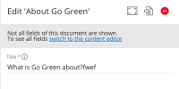
Please see the attached images.
Acceptance Criteria
1) The icons are no longer buttons and do not have a click-interaction
2) The icons have a hover tooltip which reflects the status of the document: 'Live' VS 'Offline' VS 'a previous version is live'
3) The icons are moved from the right to the left hand side of the VE panel
4) The 'switch to content perspective' button (see attached) takes users to the view-mode in the content perspective rather than edit-mode
5) The title of the panel is simply [document name]
Reason for change: because the icons are on the right-hand side, and clickable, users think clicking on them will publish or depublish something; their meaning is unclear and people are surprised when they get taken to the content perspective
Attachments
Issue Links
- causes
-
CMS-12685 Align elements in the header of the right side panel
-

- Open
-
- relates to
-
CHANNELMGR-2098 Add X-button for close to header of the right side panel
-

- Closed
-


