Details
-
Bug
-
Status: Closed
-
 Normal
-
Resolution: Fixed
-
None
-
None
-
1
-
Tiger Sprint 176
Description
While testing ESSENTIALS-1108 I discovered some small issues that can easily be improved to enhance usability and consistency in layout across panels.
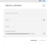
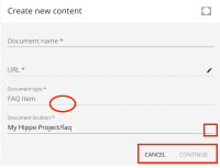
- A click on the document location field opens a picker. The end of the field should have a magnifying glass icon, like on other picker fields.
- When you mouseover the line below the Document type field the cursor changes to a hand, as if you could click and edit it, which is not the case.
- The Cancel / Continue buttons are positioned different than on the Edit content panel. Here they are immediately below the fields, in Edit content they are always at the bottom. There they have a separate box that clearly separates the fields from the actions. Suggestion: update the Create content panel to match the Edit content panel.

