Details
-
Improvement
-
Status: Closed
-
Low
-
Resolution: Fixed
-
CMS-10.0-alpha-1
-
Sprint 105
Description
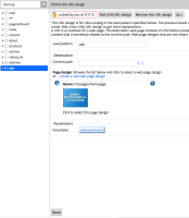
In the new layout the save button for elements in the hst config editor has moved to the bottom of the screen (see attached screenshot). This UI is already confusing and hard to understand because it is so different from other UIs in the channel manager.
The button used to be immediately below the input fields (in the screenshot: just below the parameters field). It has a much better chance of being noticed at that location. Can it move back to that place please?
Attachments
Issue Links
- relates to
-
HSTCONFIGEDIT-174 [URL & navigation] Style contents
-
- Closed
-
