Details
-
Bug
-
Status: Closed
-
 Normal
-
Resolution: Fixed
-
None
-
0.5
-
Sprint 102
Description
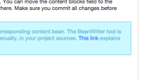
Essentials uses the "alert" boxes in various locations. The styling provided by the Hippo Theme (trunk) is currently using colors that have too low a contrast, suggesting that the text is "greyed out" somehow. Also, the "info" colors appear rather close to the color used to highlight links.
Change color scheme to fix contrast issues in, for example, alerts/panel headings/contextual backgrounds

