Uploaded image for project: '[Read Only] - Hippo Essentials'
  1. [Read Only] - Hippo Essentials
  2. ESSENTIALS-387

notification icons not well aligned

    XMLWordPrintable

Details

    • Bug
    • Status: Closed
    • Normal
    • Resolution: Fixed
    • None
    • GA, 1.02.00
    • None
    • None
    • Chrome on MacOS
    • GA Hardening

    Description

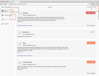
      After installing a feature, the notification icons (the numbers) are not correctly aligned with the other texts. This happens both for the "Installed features" button on the left as well as the message indicator on the top right.

      Also notice that the incorrect alignment causes the top bar to overlap with the side bar.

      See screenshot for details.
      Attachments

        Activity

          People

            Unassigned Unassigned
            oscholten Oscar Scholten (Inactive)
            Votes:
            0 Vote for this issue
            Watchers:
            4 Start watching this issue

            Dates

              Created:
              Updated:
              Resolved: