Details
-
Bug
-
Status: Closed
-
 Normal
-
Resolution: Fixed
-
10.2.2
-
None
-
Flagged
Description
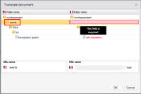
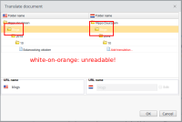
The selected items in the translation dialog are rendered as white text on a light-orange background. That is very hard to read (see screenshot). The text should be black, not white.
Attachments
Issue Links
- is backported by
-
CMS-10523 [Back port to 11.1] Selected text in document translation dialog is very hard to read
-

- Closed
-
-
CMS-10524 [Back port to 11.0] Selected text in document translation dialog is very hard to read
-

- Closed
-
-
CMS-10525 [Back port to 10.2] Selected text in document translation dialog is very hard to read
-

- Closed
-

