Details
-
Bug
-
Status: Closed
-
High
-
Resolution: Fixed
-
r2.15.00
-
None
-
None
Description
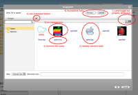
1) View-toggle not properly positioned
Problem: View-toggle (thumb/list) is positioned outside its 'habitat'.
Improvement: Position view-toggle right aligned and vertically centered on the bar.
2) Missing selected state
Problem: There is no slected state in thumbnail-view
Improvement: Create a selected state style.
NOTE: Use same color for file names as in list view (#000000, thus not the blue color)
3) Incorrect file name
Problem: File name and file extension are not separated by a dot.
Improvement: import file name exactly the same as original
4) Inconsistent fonts
Problem (minor): different fonts and/or fontsizes are used.
Improvement: Use standard font for all CMS ui elements (Tahoma)
5) No transparency
Problem: transparent images (png's and gif's) are displayed with a black background. This happens not only in the picker but trhoughout the entire CMS, and possibly on de website as well (didn't check that)
Solution: ... Don't know, other import tool?
6) non fucntional button
Problem: the 'back' button in the pickers doesn't do anything.
Solution: remove button from UI
Attachments
Issue Links
- relates to
-
CMS-4169 Minor visual improvement image picker
-

- Closed
-
