Uploaded image for project: 'Hippo CMS'
  1. Hippo CMS
  2. CMS-2559

Workflow icons

    XMLWordPrintable

Details

    • Task
    • Status: Closed
    • Normal
    • Resolution: Duplicate
    • None
    • None
    • None
    • None

    Description

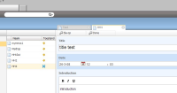
      Workflow icons are still not very clear.

      For example:
      if you published an item and then edited it - so live and preview version are different-, the icon is a blue cross.
      This is the same icon as the offline icon. This confuses people a lot.
      The hover text is fine (status: bewerkt) in Dutch is also confusing. This should be: "online, but edited offline" or something like that.
      Attachments

        Activity

          People

            Unassigned Unassigned
            mbrand Mathijs Brand (Inactive)
            Votes:
            0 Vote for this issue
            Watchers:
            0 Start watching this issue

            Dates

              Created:
              Updated:
              Resolved: