Details
-
Improvement
-
Status: Closed
-
 Normal
-
Resolution: Fixed
-
r2.01.xx (m08)
-
None
-
None
Description
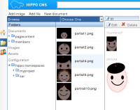
In the list of images, there is a fixed vspace for each name+thumbnail. Thumbnails that do not fit, are clipped. I think that is ugly.
Solutions:
1) Make thumbnails with fixed width, but preserve aspect ratio and show that in full in the list, allowing to take up flexible vspace. Upto some limit of course. Like an aspect ratio of 2 as limit. Above that the same as solution 2.
2) Make thumbnails with fixed height, but preserve the aspect ratio and show that in full in the list. Thumbnails which are thin, will not take up all the hspace reserved for thumbnails.
Solution 2) has the disadvantage that thumbnails can get very small if they have very different aspect ratio as there is room reserved in the list.
Solution 1) has the disadvantage that the list would look less well ordered, but clipped thumbnails have that disadvantage even more.
So I would go for solution 1.
