Details
-
Bug
-
Status: Closed
-
Low
-
Resolution: Fixed
-
2.01.00m06.4
-
None
Description
The "New document" popup shows some very weird (for the average user) and inconsistent behavior.
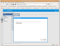
When clicking on "New document" directly under the "HIPPO CMS" header, when on the dashboard, the popup that appears has the name "new-document-label" (see new-document-label.png) and shows one dropdown for the document type.
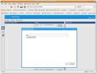
When clicking on "New document" directly under the "HIPPO CMS" header, when in the browse tab, the popup also has the name "new-document-label" but shows two dropdowns, for different actions (New Document, New Folder) as well as the document type. When selecting e.g. New Folder in the first dropdown, the popup window name remains "new-document-label". See two-dropdowns.png.
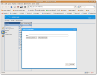
When selecting "New Document" (notice the inconsistent use of capitals) from the dropdown in the browse tab, the popup that appears has the name "Add New Document" and only the one dropdown for document types. See "Add New Document.png".
I know this is a minor issue but it's little things like this that confuse the user, and make the GUI look messy and unprofessional.
Attachments
Issue Links
- is a part of
-
CMS-1651 Attractive interface
-
- Closed
-


