Details
-
Bug
-
Status: Closed
-
 Normal
-
Resolution: Fixed
-
5.0.0
-
None
-
None
-
1
-
Tiger
-
Tiger Sprint 162
Description
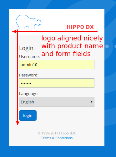
The logo on the login screen is not aligned correctly. The result is a bad very first impression of the product.
The logo in Hippo CMS 11.2 is aligned nicely. The bottom of the logo is aligned with the bottom of the product name, and the left leg of the hippo is aligned with the left side of all form fields.
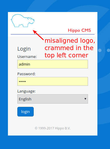
The logo in Hippo CMS 12 is not aligned nicely. Is looks crammed into the top left corner of the login screen. It also looks a bit blurry on my screen (and so does the product name). It's probably better to optimize the logo for the intended resolution instead of scaling down a huge SVG image (which is what happens now).