Details
-
Improvement
-
Status: Closed
-
 Normal
-
Resolution: Fixed
-
None
-
None
-
2
-
Tiger Sprint 208, Tiger Sprint 209
Description
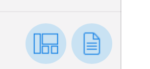
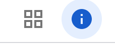
Selected toggle button (indicating that overlay is displayed) is blue, unselected toggle button (indicating that overlay is hidden) is black but there is no further distinction between the buttons. In recent versions of Google apps, the 'pressed' appearance for the icon buttons (coloured icon and background circle) is used to indicate the selected state. This is much clearer than just the colour change.
Example from Google Drive:

From latest Experience Manager designs

Also, the tool tip for left sidepanel and overlays could be made clearer:
'Show container and component outlines'
'Show content buttons'
'Show sitemap and components'